All projects
UX/UI redesign · Website · Information architecture · Visual direction — 2024
Cyril Bazin
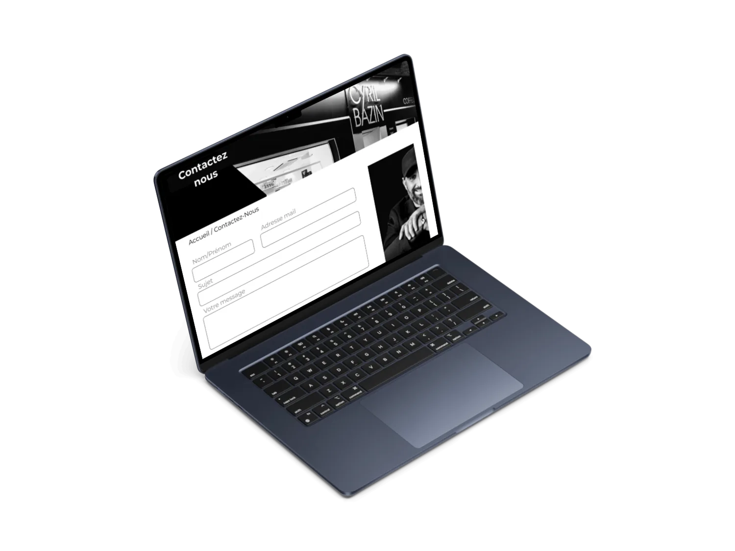
Rethinking an interface to better reflect the salon
Context
The project consisted in reviewing the experience and interface of the Cyril Bazin website. The challenge was not just to make the existing site prettier, but first to understand how it worked, its content and its navigation difficulties.
Challenge
How can the website be made simpler to browse, more accessible to use and more faithful to the salon's visual world?
Approach
- 01Analysis of the existing interface
- 02Understanding its organisation
- 03Identifying misunderstandings and friction points
- 04Restructuring the content
- 05Improving the essential journeys
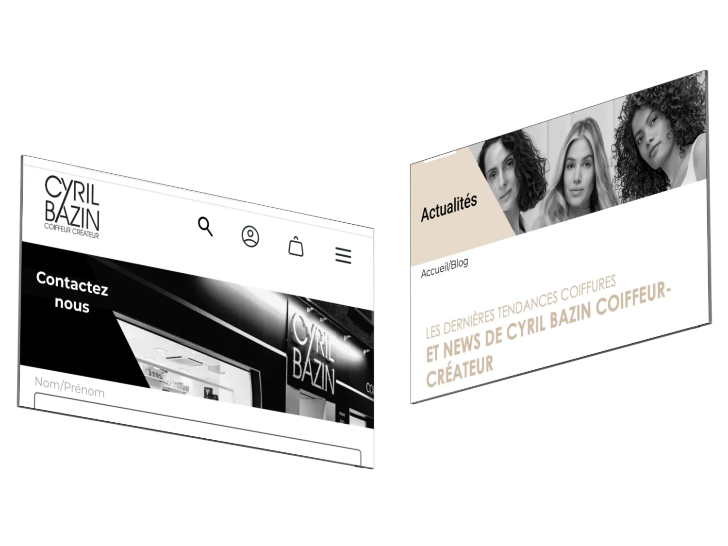
- 06Redesigning the screens
- 07Creating a clearer, more contemporary visual direction
- 08Checking consistency between functional needs and graphic choices
Key decisions
- Restructure the information before redesigning: the content hierarchy is set first, style comes after
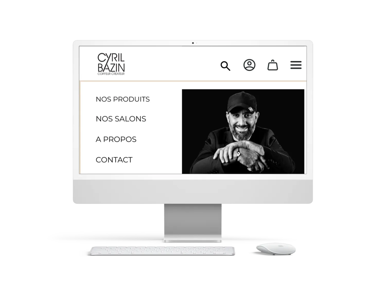
- Reduce navigation to the entries that are actually useful and keep contact permanently visible
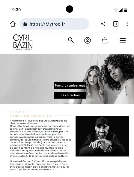
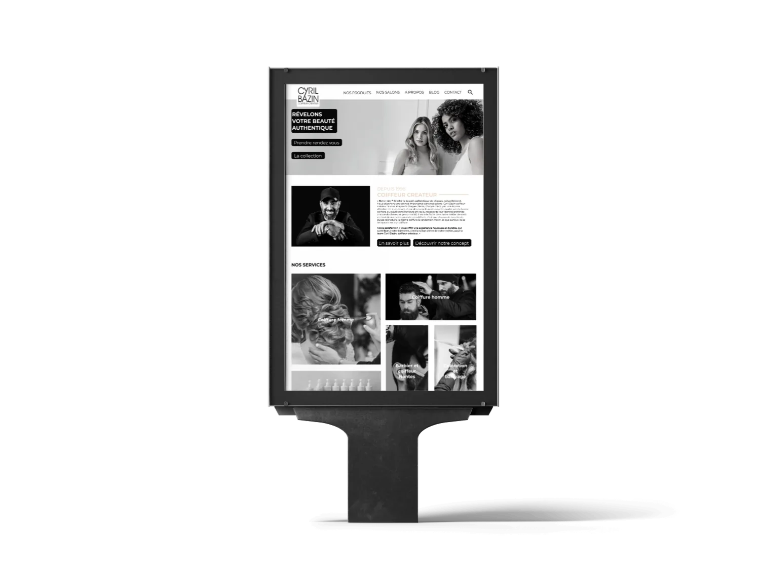
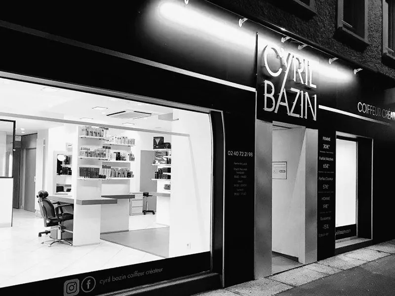
- Adopt a contrasted black-and-white visual direction, consistent with the salon's image rather than with the generic codes of the sector
Deliverables
- Audit of the existing interface and its organisation
- Restructured information architecture
- Mock-ups of the main screens (home, products, salons, about, news, contact) in desktop and mobile versions
- Visual direction and interface rules
Outcome
A clearer, better structured and visually higher-quality interface. The redesign makes important information easier to reach while giving the website a presence more consistent with the salon's image.
What this project demonstrates
My ability to audit a website, understand its logic, restructure information and turn UX findings into a finished interface.